


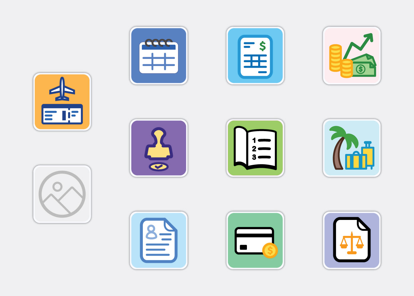
To complement their new intranet design, a regional healthcare facility requested a full set of icons that would reflect their new look. By breaking down the essential purpose of each app into a single image, we can quickly get across to the user the function of each app.
Matching the aesthetic of the intranet, I adopted an expressive color palette and flat design style with rounded corners that come across as modern yet friendly and engaging. You can see this design language across the whole icon set, telling a cohesive story.